
 |
||||||||
Printers work by printing dots of three or four inks (cmyk or cyan, magenta, yellow and black ) to produce a given colour. As only 3 colours are available the dots are laid out in specific patterns or a matrix to create in between ones. This means that if you look closely or scan at medium resolution you can see the dots and the matrix. Depending upon the printing technology the matrix may be anything from a 4x4 grid up to about 8x8. the larger the grid the better it is at reproducing a given colour but as each matrix corresponds to a single pixel on screen the lower the resolution of the image.
The printing industry works in lines per inch (lpi) not dots per inch (dpi) where the number of lpi is the number of matricies that fit in a line. Newspapers work at about 85 lpi, magazines at 133lpi and fine prints at up to 175 lpi..
Considering a modern monitor displays about 75 dpi (where each dot is a set of rgb sub-pixels which can produce the full range of colours) this is roughly equivalent to a newspaper in resolution, however a newspaper will generally use a small matrix so colours will not be as accurate.
To convert from lpi to dpi simply multiply the lpi by the number of dots across the matrix.
e.g
These scan of Vertical Limit shows the problem,
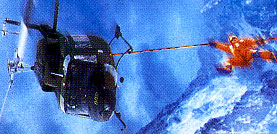 150 dpi
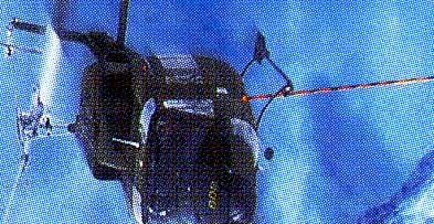 300 dpi
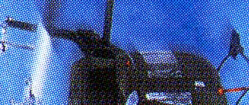 600 dpi
Even when compressed quite heavily using jpeg the dot pattern shows through. Even the highly compressed lowest resolution scan shows artefacts.
This effect can be avoided by descreening the scan as it is made. Descreening is a filter applied by the scanning software, knowing the numer of lines per inch the image was printed at enables it to work out what the original colours should have been.
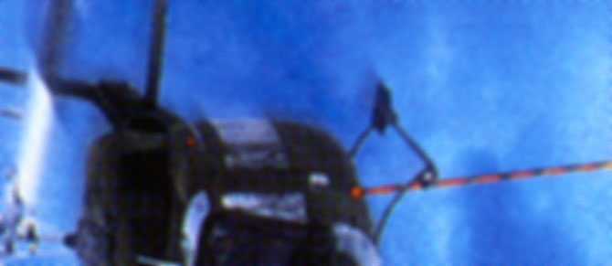
85 lpi descreening

133 lpi descreening

175 lpi descreening
You can see from the shots that 85 lpi descreening creates a fuzzy image and at 175 lpi descreening you can still see the printing matrix. 133 lpi appears to be the closest to the printing technology used.
Printers also use spot colours (see basic colour tutorial). If you wish to extract the parts of the image which used spot colours do not descreen the image as spot colours are not printed ion a dot matrix pattern.
From the same Vertical Limit cover
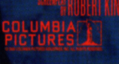
descreened at 133lpi
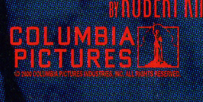
No descreening
The background blue is the general dotty make up of cmyk dots
The red text is a spot colout and the edges are much more defined. This is suitable for extracting logos
From the same cover

The black spot colour makes the gentle curves of the DD symbol much more clearly defined than it would have been otherwise
Once an image is scanned follow the basic image manipulation tutorial to get the best results.